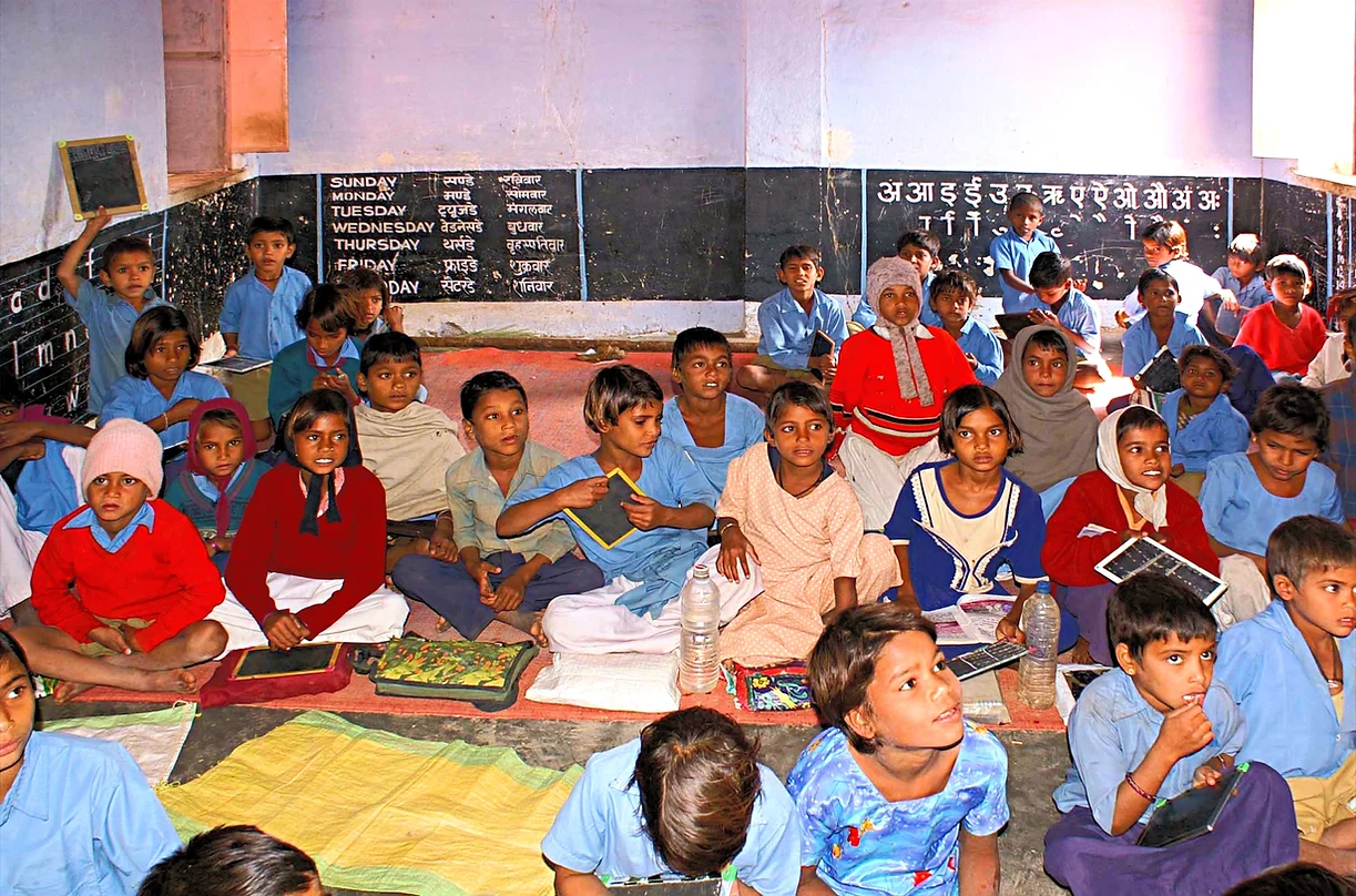
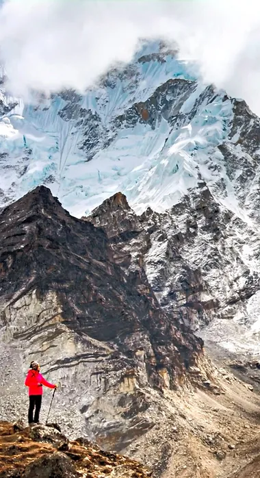
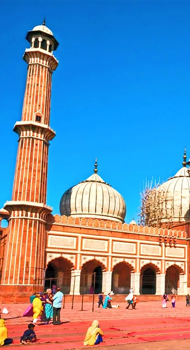
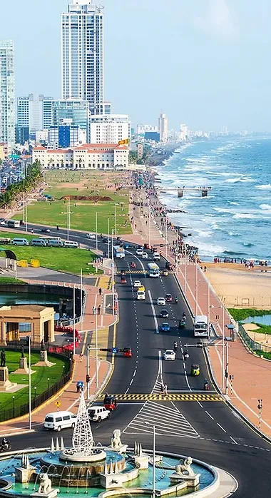
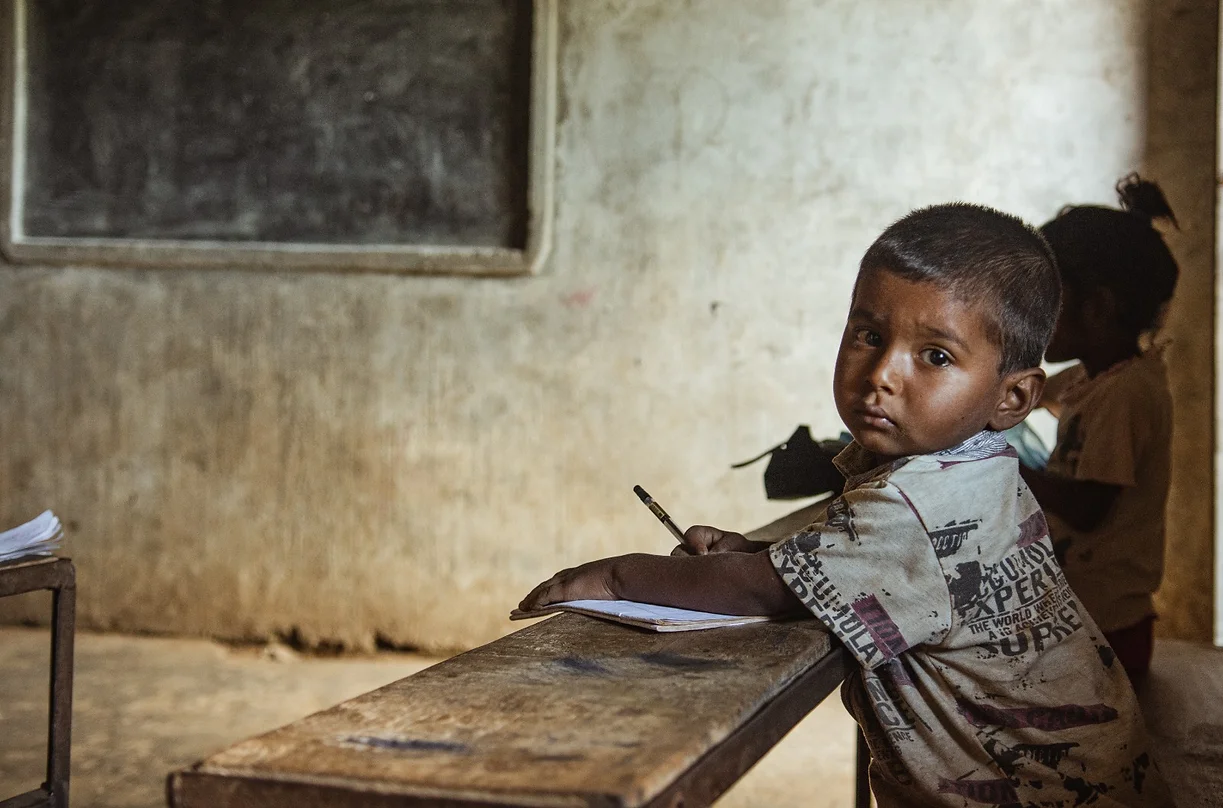
top of page

Capital Letters of

South Asia

Square Blocks Reminiscent Togetherness and Solidarity

Capital Letters of

Humanitarian Association

The Bond Established Between Different Geographies With Two Separate Ground Forms

Brotherhood Bridges Established Between Philanthropists and Needy People with "A" Bridge Form

The Color of Hope and Peace "Blue"
Symbol of Clean Intent "White"

Bold and Accented Letters

Statement of Dedication, Effort, Perseverance

The Story Behind Our Logo

We aimed to make our main goals and indispensable values felt in our logo, which is one of the basic elements of our institutional identity.

We created the form of our logo from square blocks, reminiscent of solidarity and built “South Asia” on the basis of the “Humanitarian Association” . In this way, we emphasized solidarity between different geographies (the center and the field [SAHA]).

At the same time, we have expressed the brotherhood bridges we have established between philanthropists and those in need using a bridge shape while forming the letter "A".

We chose blue, the color of hope and peace, as it is our mission to bring hope for the generations to grow in the geographies we operate and to provide peace to the people who try to survive under difficult conditions. We set the color of our letters as white to highlight our pure intentions.

We used the letters in bold (strong) and accentuated to represent our determined and willing volunteers who strive with various sacrifices in the field.

To conclude, we also supported SAHA's message with our logo:


To offer an aspiration for upbringing generations, and peace and trust to people in difficult conditions, by establishing fraternity bridges with the spirit of solidarity between different geographies, with committed and volunteer supporters and a crystal clear intention...​

We're in the field to serve!

bottom of page